Before I look into some of the technical terms and use of fonts and typeface in my typography series I thought it would first be nice to look at what makes up the structure of the text we use and so I introduce…..
The Anatomy of Letters
So how are letters and characters made or built up…..
There are many many “bones” that make up the skeleton of each and every letter, to give a definition of them all would take an eternity and so I have added a graphical representation in order to demonstrate the terms in brief and followed with a sort meaning….
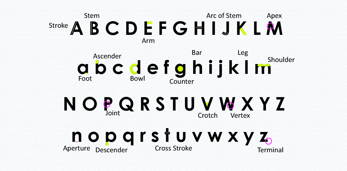
Stroke – A single linear element that forms part of a character; may be straight or curved.
Stem – The main (usually vertical) stroke of a letterform.
Arc of Stem – A curved stroke that is continuous with a stem.
Foot – The part of the stem that rests on the baseline.
Descender – A piece of a letter that extends below the baseline.
Ascender – A part of a lowercase letter that rises above the main body of the letter (above the x-height).
Joint – The point where a stroke connects to a stem.
Apex – The uppermost connecting point of a letterform where two strokes meet; may be rounded, sharp/pointed, flat/blunt, etc.
Vertex – The point at the bottom of a character where two strokes meet.
Crotch – The inside angle where two strokes meet.
Arm – A horizontal stroke that does not connect to a stem on one or both ends.
Leg – A short, descending stroke on a letterform.
Shoulder – A curved stroke extending down from a stem.
Bar / Crossbar – An enclosed horizontal stroke.
Cross Stroke – A line that extends across/through the stem of a letter.
Bowl – The closed, round or oval curve of a letter.
Counter – An enclosed or partially enclosed area of white space within a letter; could be bounded by curves, strokes, or stems.
Aperture – The opening or partially enclosed negative space created by an open counter.
Double-Story – A type of letter that has two counters (as opposed to the single-story version, which has only one counter).
Terminal – The end of any stroke that doesn’t include a serif; includes ball terminals (circular in shape) and finials (curved or tapered in shape).
Swash – A decorative extension or stroke on a letterform; may be part of a letter by design or available either as an additional glyph or as an add-on to the standard character.
Ligature – Two or more letters that are connected to form one character; primarily decorative (the embellishment that connects the two letters is called a “gadzook”).
Make sure to bookmark this page as your typography glossary and a complete visual reference to all the typographic anatomy terms covered in this article!