A brief explanation of a few typography technical terms….
So have you ever been confused about “Leading” & “kerning” or “Fonts” & “Typeface”….. I’m sure even some of you experts out there have at times.
The Basics…
Font vs. Typeface
Which is which and what’s the difference?
Back in the days of metal type and printing presses, fonts and typefaces were two different things — the typeface was the specific design of the letters, say Times New Roman or Baskerville; while the font referred to the particular size or style of that typeface, say 10 point regular or 24 point italic (each created as its own collection of cast metal letters and other characters). Today, however, many designers use the terms more or less interchangeably. The best and most straightforward modern definition I’ve run across (courtesy of Fontshop) goes as follows:
“A collection of letters, numbers, punctuation, and other symbols used to set text (or related) matter. Although font and typeface are often used interchangeably, font refers to the physical embodiment (whether it’s a case of metal pieces or a computer file) while typeface refers to the design (the way it looks). A font is what you use, and a typeface is what you see.”
Characters and Glyphs
These are what makes up the typeface, the individual symbols of the full character set which may take the form of a letter, number, punctuation mark, etc. Glyphs may also make up the set adding a non-standard (sometimes decorative) variation of a character that comes as an extra option with a font file an example of this may be accented characters
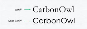
Serif or Sans Serif
Serif fonts are those with a short line or stroke attached to or extending from the open ends of a letterform; also refers to the general category of typefaces that have been designed with this feature. Sans Serif literally “without line”; the general category of typefaces (or an individual typeface) designed without serifs.
Positioning & Spacing
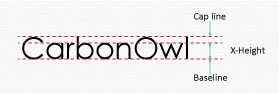
The Baseline, Cap Line and X-Height
Easily demonstrated by the graphic below the Baseline is The imaginary line on which most letters and other characters sit. The Cap Line is the imaginary line that marks the upper boundary of capital letters and some lowercase letters’ ascenders and finally the X-Height is the height of a typeface’s lowercase letters.
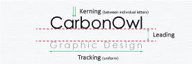
Tracking, Kerning and Leading
Tracking is the uniform amount of spacing between characters in a complete section of text (sentence, line, paragraph, page, etc.) often confused with Kerning which is the horizontal spacing between two consecutive characters; adjusting the kerning creates the appearance of uniformity and reduces gaps of white space between certain letter combinations. Leading is the vertical spacing between lines of text (from baseline to baseline).
I hope this helps with those annoying technical terms…… In Typography part 2 I will look at how the use of different fonts make designs look and feel different and how pairing of fonts is useful in artwork.